UIButton에서 테두리를 만드는 방법은 무엇입니까?
앱에서 "addButton"이라는 사용자 지정 버튼을 사용하는데 흰색으로 테두리를 두르려고 하는데 사용자 지정 버튼 주변의 흰색 테두리를 어떻게 만들 수 있습니까?
버튼의 계층 속성에 액세스하여 CAL 계층의 경계 속성을 설정할 수 있습니다.
먼저 Quartz를 추가합니다.
#import <QuartzCore/QuartzCore.h>
속성 설정:
myButton.layer.borderWidth = 2.0f;
myButton.layer.borderColor = [UIColor greenColor].CGColor;
참조:
https://developer.apple.com/documentation/quartzcore/calayer #//apple_ref/occ/cl/CALayer
위 링크의 CAL레이어를 사용하면 코너 반경, maskToBounds 등과 같은 다른 속성을 설정할 수 있습니다.
또한 버튼 재미에 대한 좋은 기사:
https://web.archive.org/web/20161221132308/http ://www.apptite.be/tutorial_custom_uibuttons.php
매우 간단합니다. 파일에 쿼츠 코어 헤더를 추가하기만 하면 됩니다(프로젝트에 쿼츠 프레임워크를 추가해야 합니다).
그리고 나서 이렇게 해요.
[[button layer] setCornerRadius:8.0f];

[[button layer] setMasksToBounds:YES];

[[button layer] setBorderWidth:1.0f];
필요에 따라 부동 소수점 값을 변경할 수 있습니다.
즐거운 시간 되세요.
여기 전형적인 현대식 코드가 있습니다...
self.buttonTag.layer.borderWidth = 1.0f;
self.buttonCancel.layer.borderWidth = 1.0f;

self.buttonTag.layer.borderColor = [UIColor blueColor].CGColor;
self.buttonCancel.layer.borderColor = [UIColor blueColor].CGColor;

self.buttonTag.layer.cornerRadius = 4.0f;
self.buttonCancel.layer.cornerRadius = 4.0f;
세그먼트 컨트롤과 유사한 모양입니다.
업데이트 for Swift:
- QuartzCore를 추가할 필요 없음
그냥 하기:
button.layer.cornerRadius = 8.0
button.layer.borderWidth = 1.0
button.layer.borderColor = UIColor.black.cgColor
그리고 신속하게 "QuartzCore/QuartzCore"를 가져올 필요가 없습니다.h"
그냥 사용:
button.layer.borderWidth = 0.8
button.layer.borderColor = (UIColor( red: 0.5, green: 0.5, blue:0, alpha: 1.0 )).cgColor
또는
button.layer.borderWidth = 0.8
button.layer.borderColor = UIColor.grayColor().cgColor
계층 설정 문제borderWidth그리고.borderColor버튼을 누르면 테두리가 강조 표시 효과를 나타내지 않습니다.
물론 버튼의 이벤트를 관찰하고 그에 따라 테두리 색상을 변경할 수 있지만 그럴 필요는 없습니다.
또 다른 옵션은 확장 가능한 UI 이미지를 만들어 버튼의 배경 이미지로 설정하는 것입니다.이미지에 이미지 세트를 생성할 수 있습니다.다음과 같은 xcassets:
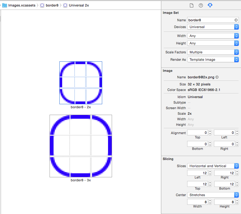
그런 다음 버튼의 배경 이미지로 설정합니다.
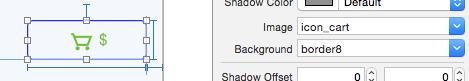
이미지가 템플릿 이미지인 경우 버튼의 색조를 설정할 수 있으며 테두리가 변경됩니다.
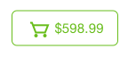
이제 버튼을 누르면 테두리가 강조 표시됩니다.
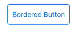
다음은 Ben Packard의 답변에서 업데이트된 버전(Swift 3.0.1)입니다.
import UIKit
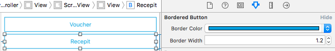
@IBDesignable class BorderedButton: UIButton {
@IBInspectable var borderColor: UIColor? {
didSet {
if let bColor = borderColor {
self.layer.borderColor = bColor.cgColor
}
}
}
@IBInspectable var borderWidth: CGFloat = 0 {
didSet {
self.layer.borderWidth = borderWidth
}
}
override var isHighlighted: Bool {
didSet {
guard let currentBorderColor = borderColor else {
return
}
let fadedColor = currentBorderColor.withAlphaComponent(0.2).cgColor
if isHighlighted {
layer.borderColor = fadedColor
} else {
self.layer.borderColor = currentBorderColor.cgColor
let animation = CABasicAnimation(keyPath: "borderColor")
animation.fromValue = fadedColor
animation.toValue = currentBorderColor.cgColor
animation.duration = 0.4
self.layer.add(animation, forKey: "")
}
}
}
}
결과 버튼은 StoryBoard 내부에서 사용할 수 있습니다.@IBDesignable그리고.@IBInspectable꼬리표
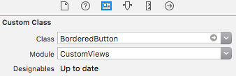
또한 정의된 두 가지 속성을 사용하여 경계 너비와 색상을 인터페이스 작성기에서 직접 설정하고 결과를 미리 볼 수 있습니다.
테두리 반지름 및 강조 페이딩 시간에 대해 유사한 방식으로 다른 속성을 추가할 수 있습니다.
설정한 반경, 색상 및 너비 버튼을 변경하려면 다음과 같이 설정합니다.
self.myBtn.layer.cornerRadius = 10;
self.myBtn.layer.borderWidth = 1;
self.myBtn.layer.borderColor =[UIColor colorWithRed:189.0/255.0f green:189.0/255.0f blue:189.0/255.0f alpha:1.0].CGColor;
이것은 스위프트 3.0 최신 버전에서 다양한 방법으로 달성할 수 있습니다. 2017년 8월 -
옵션 1:
UI 버튼에 borderWidth 속성 값을 직접 할당합니다.
btnUserButtonName.layer.borderWidth = 1.0
UI 버튼에 대한 기본 색상 값으로 제목 설정:
btnUserButtonName.setTitleColor(UIColor.darkGray, for: .normal)
UI 버튼의 테두리 속성 값에 대해 기본 색상으로 테두리 설정:
btnUserButtonName.layer.borderColor = UIColor.red
UI 버튼의 테두리 속성 값에 대해 사용자 정의 색상을 설정합니다.
   let myGrayColor = UIColor(red: 0.889415, green: 0.889436, blue:0.889424, alpha: 1.0 )
   btnUserButtonName.layer.borderColor = myGrayColor.cgColor
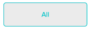
옵션 2: [권장]
확장 방법을 사용하면 응용프로그램 전체에 걸쳐 버튼이 일관되게 표시되고 여러 줄의 코드를 반복할 필요가 없습니다.
//Create an extension class in any of the swift file

extension UIButton {
func setBordersSettings() {
        let c1GreenColor = (UIColor(red: -0.108958, green: 0.714926, blue: 0.758113, alpha: 1.0))
        self.layer.borderWidth = 1.0
        self.layer.cornerRadius = 5.0
        self.layer.borderColor = c1GreenColor.cgColor
        self.setTitleColor(c1GreenColor, for: .normal)
        self.layer.masksToBounds = true
    }
}
코드 사용:
//use the method and call whever the border has to be applied

btnUserButtonName.setBordersSettings()
확장 방법 버튼의 출력:
은 필없다습니가가요를 수입할 필요가 없습니다.QuartzCore.h이제 iOS 8 sdk와 Xcode 6.1을 참조하십시오.
직접 사용:
[[myButton layer] setBorderWidth:2.0f];
[[myButton layer] setBorderColor:[UIColor greenColor].CGColor];
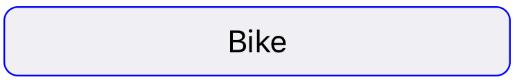
여기에 여에가 UIButton이미지를 사용하지 않고 강조 표시된 상태 애니메이션을 지원하는 하위 클래스입니다.또한 보기의 색조 모드가 변경될 때 테두리 색을 업데이트합니다.
class BorderedButton: UIButton {
    override init(frame: CGRect) {
        super.init(frame: frame)

        layer.borderColor = tintColor.cgColor
        layer.borderWidth = 1
        layer.cornerRadius = 5

        contentEdgeInsets = UIEdgeInsets(top: 5, left: 10, bottom: 5, right: 10)
    }

    required init?(coder aDecoder: NSCoder) {
        fatalError("NSCoding not supported")
    }

    override func tintColorDidChange() {
        super.tintColorDidChange()

        layer.borderColor = tintColor.cgColor
    }

    override var isHighlighted: Bool {
        didSet {
            let fadedColor = tintColor.withAlphaComponent(0.2).cgColor

            if isHighlighted {
                layer.borderColor = fadedColor
            } else {
                layer.borderColor = tintColor.cgColor

                let animation = CABasicAnimation(keyPath: "borderColor")
                animation.fromValue = fadedColor
                animation.toValue = tintColor.cgColor
                animation.duration = 0.4
                layer.add(animation, forKey: nil)
            }
        }
    }
}
용도:
let button = BorderedButton(style: .System) //style .System is important
모양:

스위프트 5
button.layer.borderWidth = 2
테두리 사용 색상 변경 방법
button.layer.borderColor = CGColor(srgbRed: 255/255, green: 126/255, blue: 121/255, alpha: 1)
****In Swift 3***
테두리를 작성하려면
 btnName.layer.borderWidth = 1
 btnName.layer.borderColor = UIColor.black.cgColor
모서리를 둥근 모양으로 만들기
btnName.layer.cornerRadius = 5
Swift 3으로 업데이트
    button.layer.borderWidth = 0.8
    button.layer.borderColor = UIColor.blue.cgColor
5)이하여 모든 의 (Swift 5) 를 생성하고 사용자 지정할 수 있습니다.UIView / UIImage / UIButton.
extension UIView {
    func makeViewBorderStyle(cornerRadius: CGFloat = 8, borderWidth: CGFloat = 1, color: UIColor = UIColor.lightGray){
        self.layer.cornerRadius = cornerRadius
        self.layer.borderWidth = borderWidth
        var borderColor = color
        if borderColor == UIColor.lightGray{
            if #available(iOS 13.0, *) {
                borderColor = UIColor.systemGray3
            } else {
                borderColor = UIColor.lightGray
            }
        }
        self.layer.borderColor = borderColor.cgColor
    }
}
그냥 일반적인 방법을 이렇게 부르면 됩니다 -->
@IBOutlet weak private var submitButton: UIButton!

override func viewDidLoad() {
        self.submitButton.makeViewBorderStyle()
    }
테두리를 커스터마이즈 하려면 원하는 값만 전달하면 됩니다 -->
self.submitButton.makeViewBorderStyle(cornerRadius: 12, borderWidth: 2, color: .red)
언급URL : https://stackoverflow.com/questions/8162411/how-to-create-border-in-uibutton
'codememo' 카테고리의 다른 글
| ASP에서 환경 변수를 읽습니다.NET 코어 (0) | 2023.05.03 |
|---|---|
| 각 루프의 역순 (0) | 2023.04.28 |
| Excel이 설치되지 않은 경우 Excel 인스턴스를 만드는 방법 (0) | 2023.04.28 |
| git push --force-with-lease vs. --force (0) | 2023.04.28 |
| aspx 페이지의 if 문 (0) | 2023.04.28 |